
Tags
nothing borrowed, and fuck all blue!
Greetings Terrans, how goes it? I’ve got a bit of a mixed bag to share with you today – a bit of speed painted cannon-fodder, and a couple of intricate minis. First up, the speedy stuff.
I’ve mentioned the rpg/virtual tabletop/inq28/Frostgrave mashup thingy that I’m running with some of my hobby homies – well, a lot of the campaign ideas have been kicking around in my skull for a good few years. It is set on a world called Spero Secundus, and originally, it was going to be a sequence of linked tabletop battles with the outcome of one game influencing the next. Over the years I’ve collected some miniatures with this in mind, and playing through the campaign in virtual has given me the urge to dig them out and get some paint on them!
First up, we have some Rad Waste types – the backstory for these guys is that they are the survivors of Hive Terminus – the hive got nuked about a century ago, and so these guys are the ancestors of the survivors. They exist in the ruins of the hive, or in the surrounding wastes. The minis are Tallarn from GW, but I’ve removed any imperial iconography, and added face shrouds and goggles where practical… In my head they are a cross between Frank Herbert’s Fremen, and folks on Tatooine:
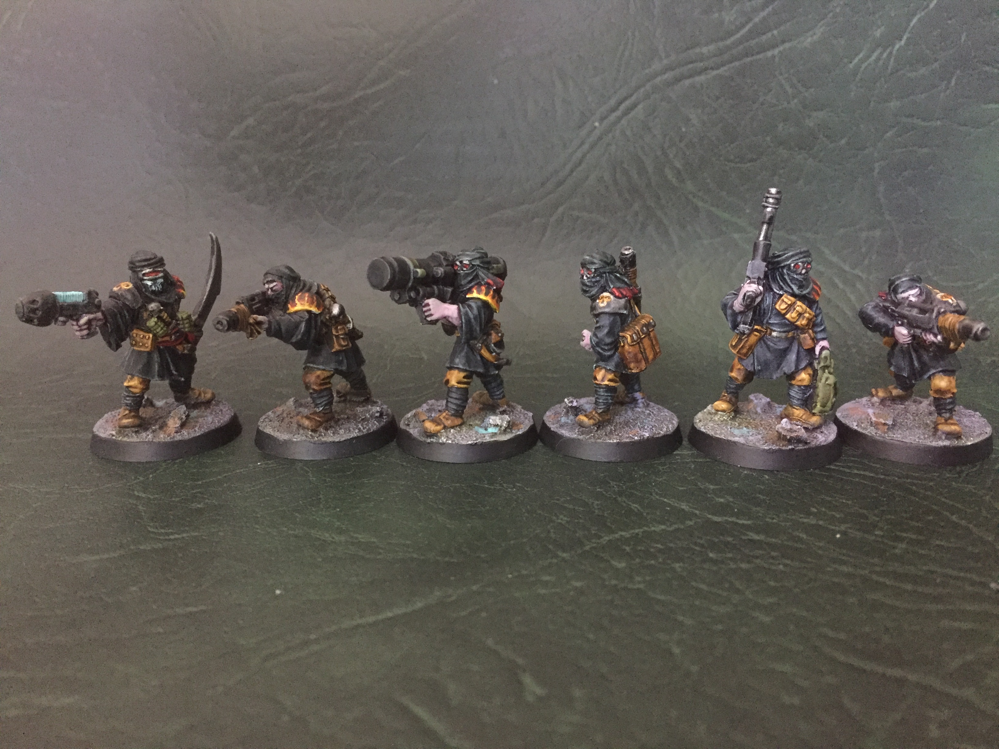
They were painted with mostly washes & contrast paints, and are deliberately drab and plain looking. I wanted them to be quick and easy to replicate, and I think I did a good job there, with the test model being completed in 32 minutes! I did add some bone & flame iconography here and there, with half an idea of having them as serfs to my Legion of the Danmed, but first and foremost, they are Rad Wasters from Spero Secundus.
Next up we have some guards for House Malocchio – the ruling house of Hive Sevelli, and governing family for the whole planet. I have already painted members of Hose Malocchio, and so the heraldic colours were already established – this made the design for the guard uniform pretty straight forward. I used GW Mordians for some proper officious pomposity:
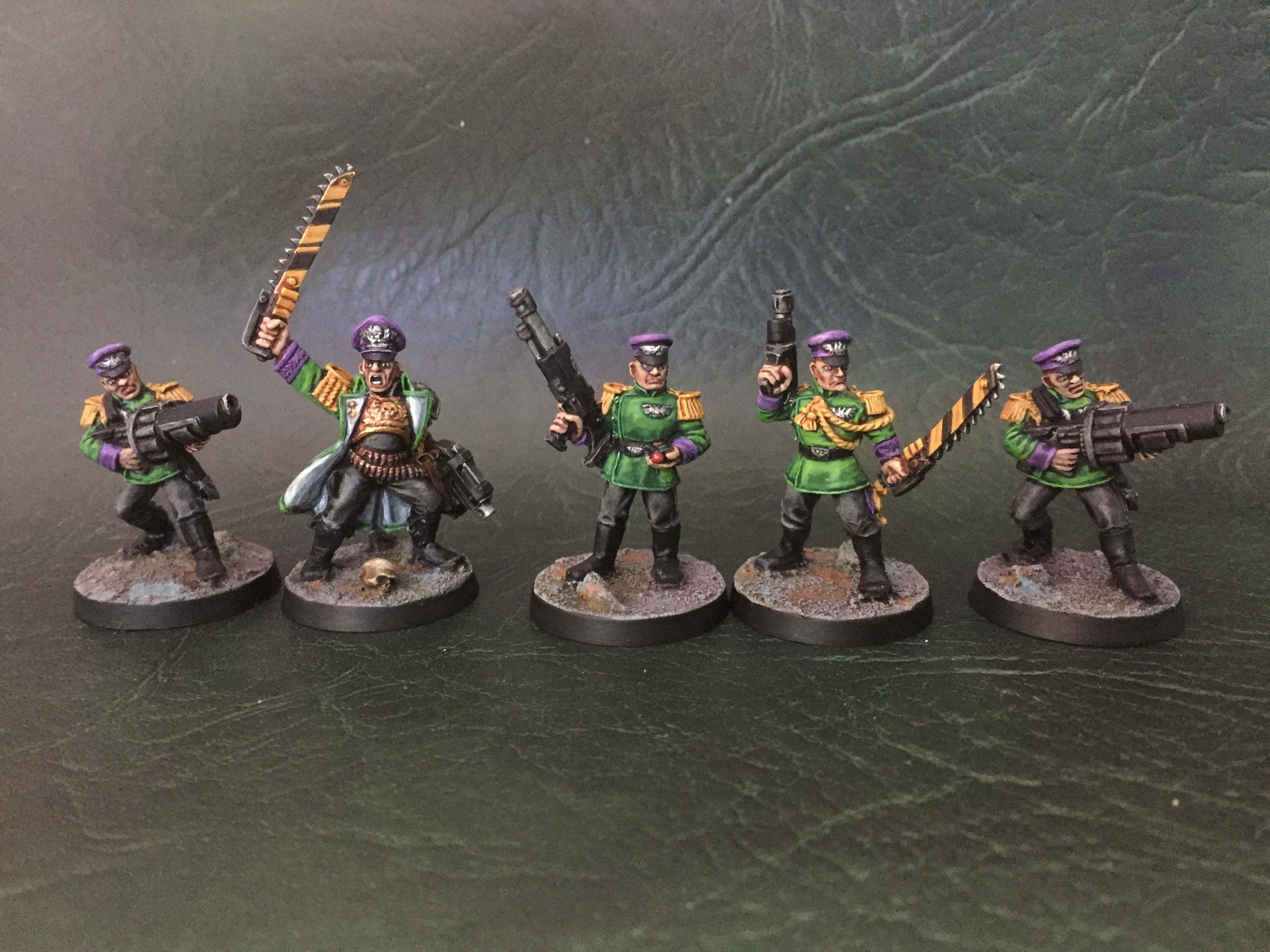
Again, I wanted these to be quick and easy to paint, so all the main colours are blocked in with washes, and ‘regular’ paints are just used to tidy up at the end and add the odd quick highlight here and there. The Lt. model got a bit more attention with a spot of gold here and there.
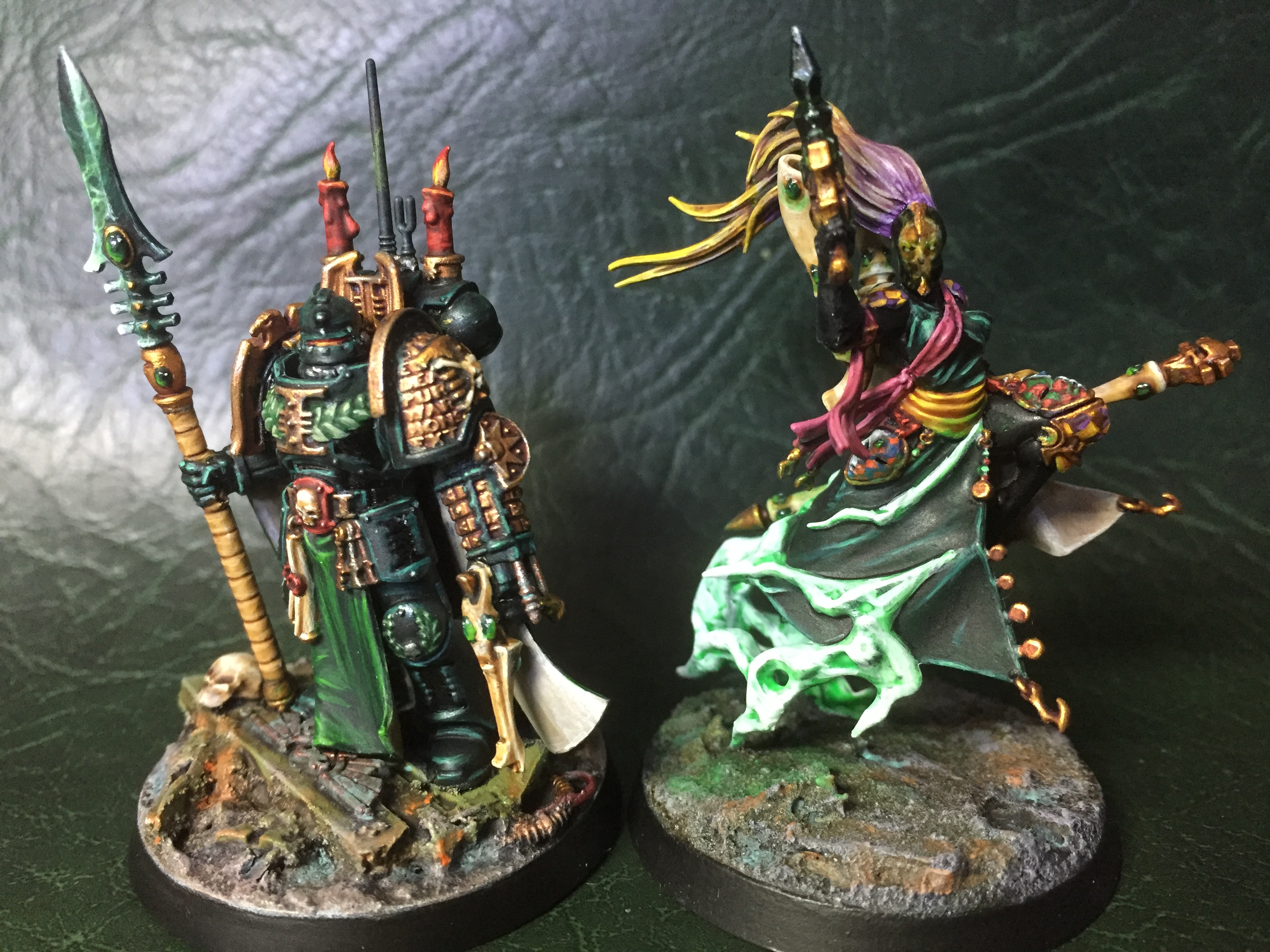
So that’s it for the speedy stuff, now for the more intricate work. This next mini is my first ever Inquisitor – a character type that I have successfully avoided over the years! He has been created in response to a new invitational called ‘Daemon Ink’ that Mark @ Heresyofus is getting up and running. Set in a corrupted library world, the setting is dark, mysterious and very Inq28, so I wanted my warband to reflect that vibe to the best of my ability. Mark mentioned that Green is very much the thematic colour for Daemon Ink, so I plan to adopt it widely in my warband – starting with the leader:
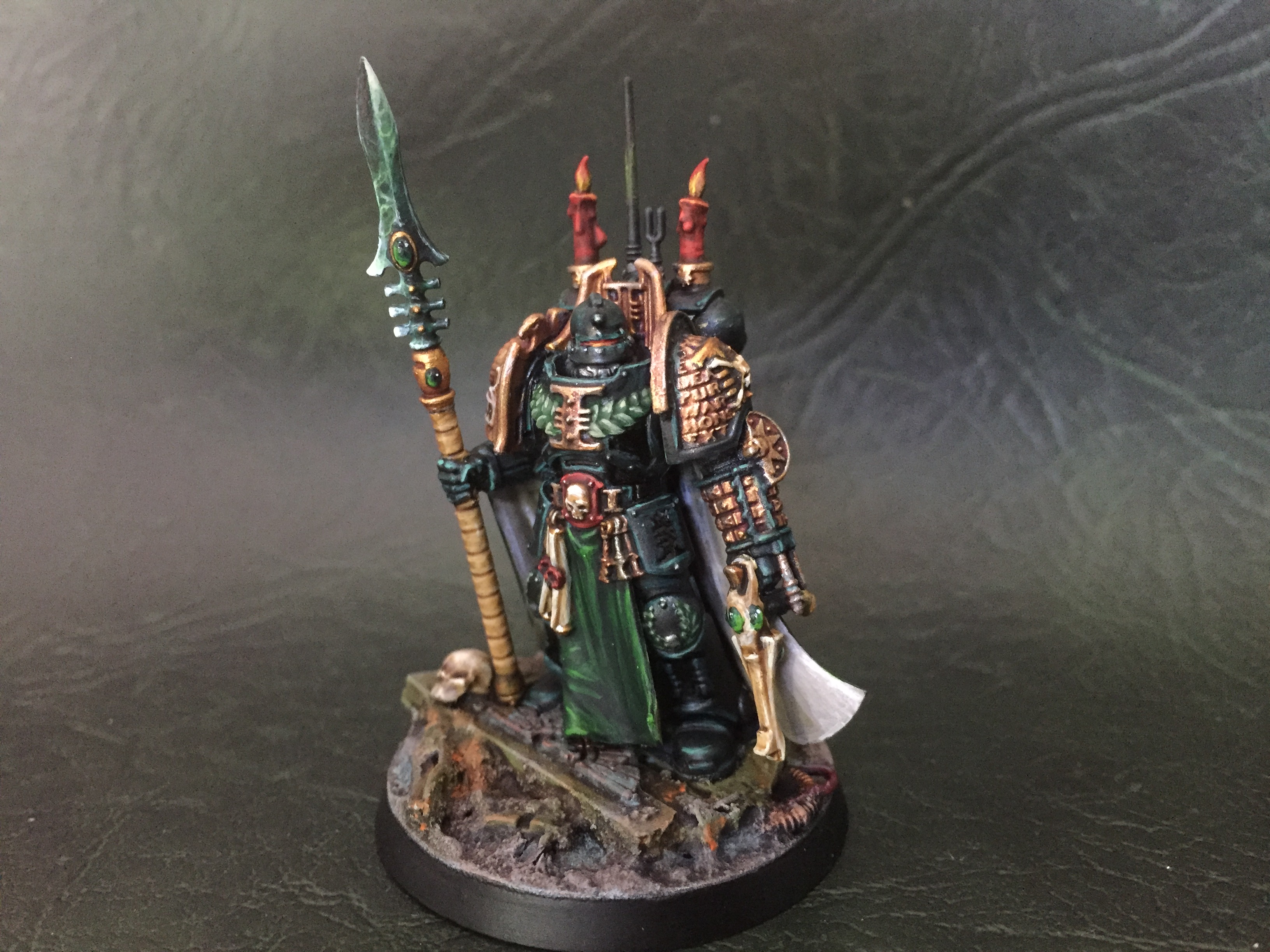
He is based on the Deathwatch watch master figure from a few years ago. The character I have in mind is definitely on the radical end of the Inquisitorial spectrum (or ‘pragmatic’ as I prefer to call it), hence the Eldar weaponry. He also had a head swap for an AdMech helm – I really like the crusader vibe this gives him! I also jazzed up his backpack a bit, partly to bring in those candles to give him a more scholarly vibe, but also to change up the silhouette & take him away from the original figure.
Paint-wise, I used gold a lot on this guy – it seemed appropriate for someone of his rank and grandiosity. Most of the gold on the armour got a cool purple wash, but the odd detail & the eldar bits had a slightly warmer sepia wash to make them stand out a bit. The rest of the armour is a very deep green, (a pot of Black Templar contrast paint with a good splodge of Winsor & Newton green ink) – it looks almost black, but the edge highlights bring out the green again I think. The odd recessed area of the armour has been carefully picked out in pure black Indian ink from Winsor & Newton – this has a slight reflective quality which gives a lacquered effect that I really like (it isn’t robust enough for a raised area, but can survive in a recess).
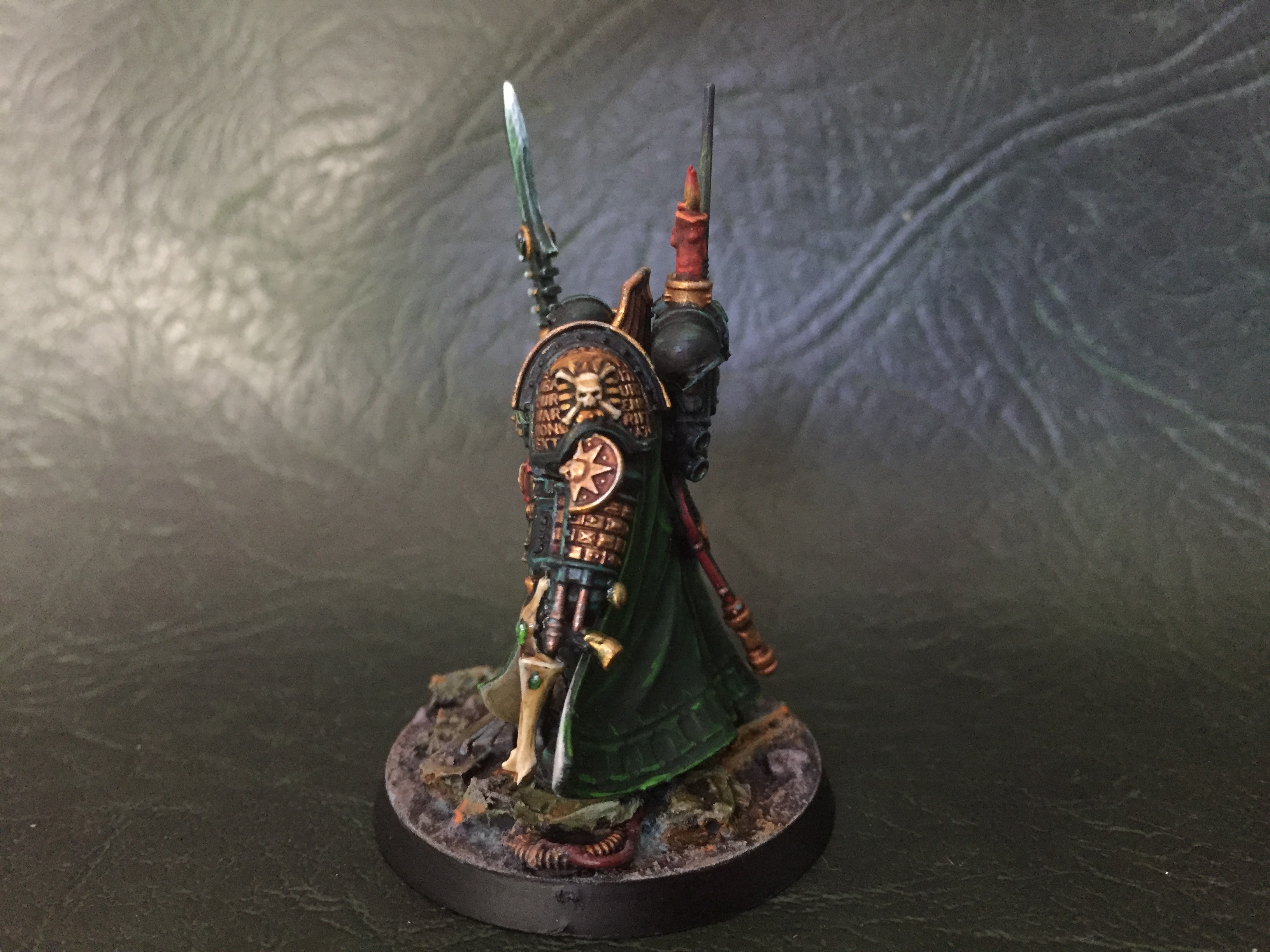
The robe is painted with a different set of greens, so it is tonally different to the armour without moving away from the theme, and I repeated the same trick for the wreath decoration on the armour and the gems. I pushed the concept to the max for the crystalline blade – I’ve never painted one of these before, but I think I did ok, and it was that was a cool thing to research and practice. Finally, a splash of red and some neutral bone completes the palette.
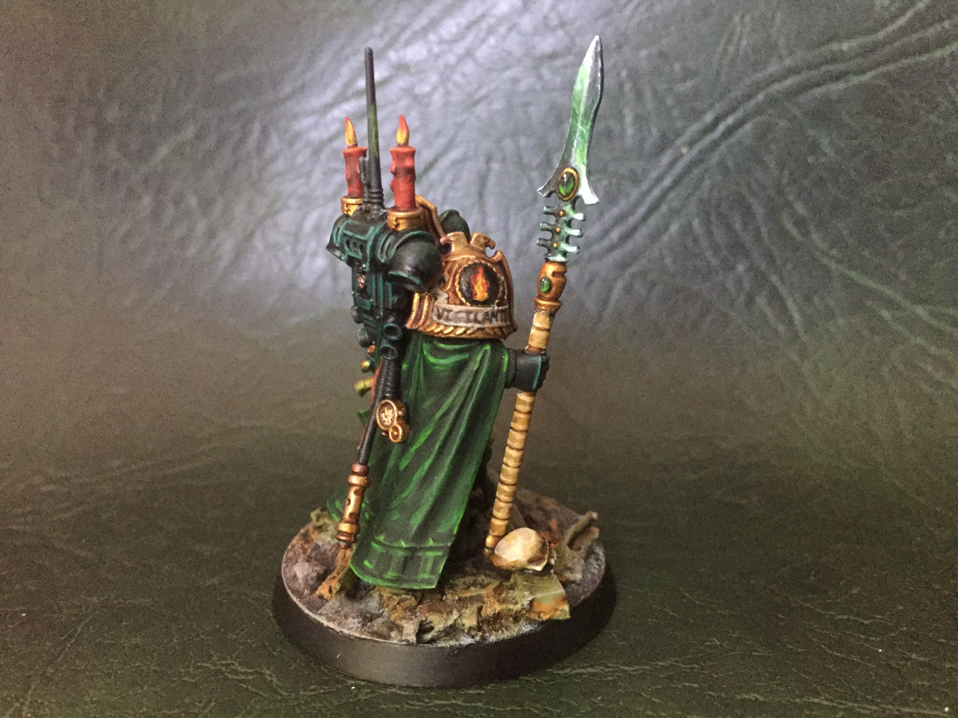
I’m not ready to share the fluff for this guy, but rest assured, he will be suitably well storied 😊
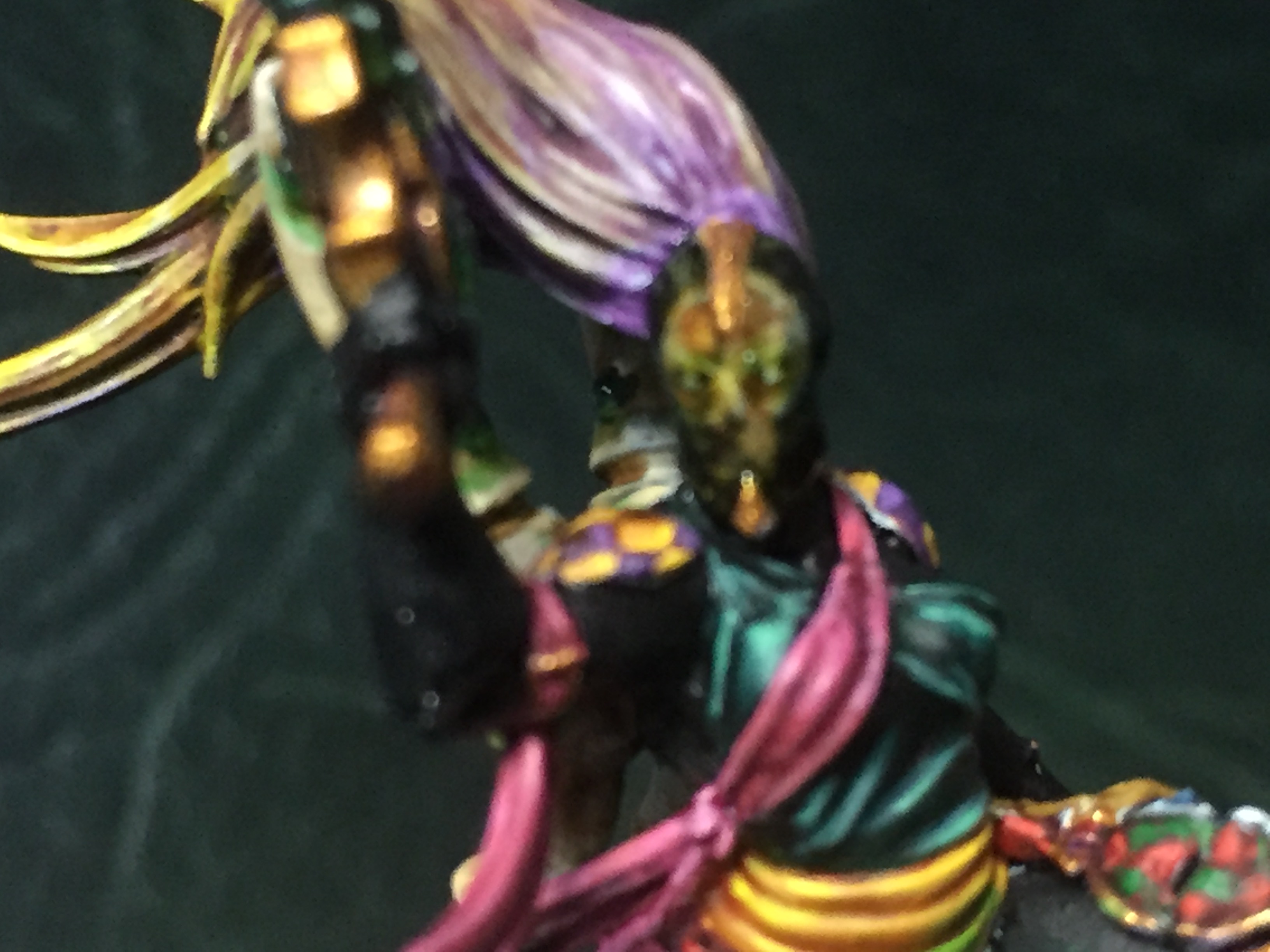
Next we have this rather exotic member of his warband:
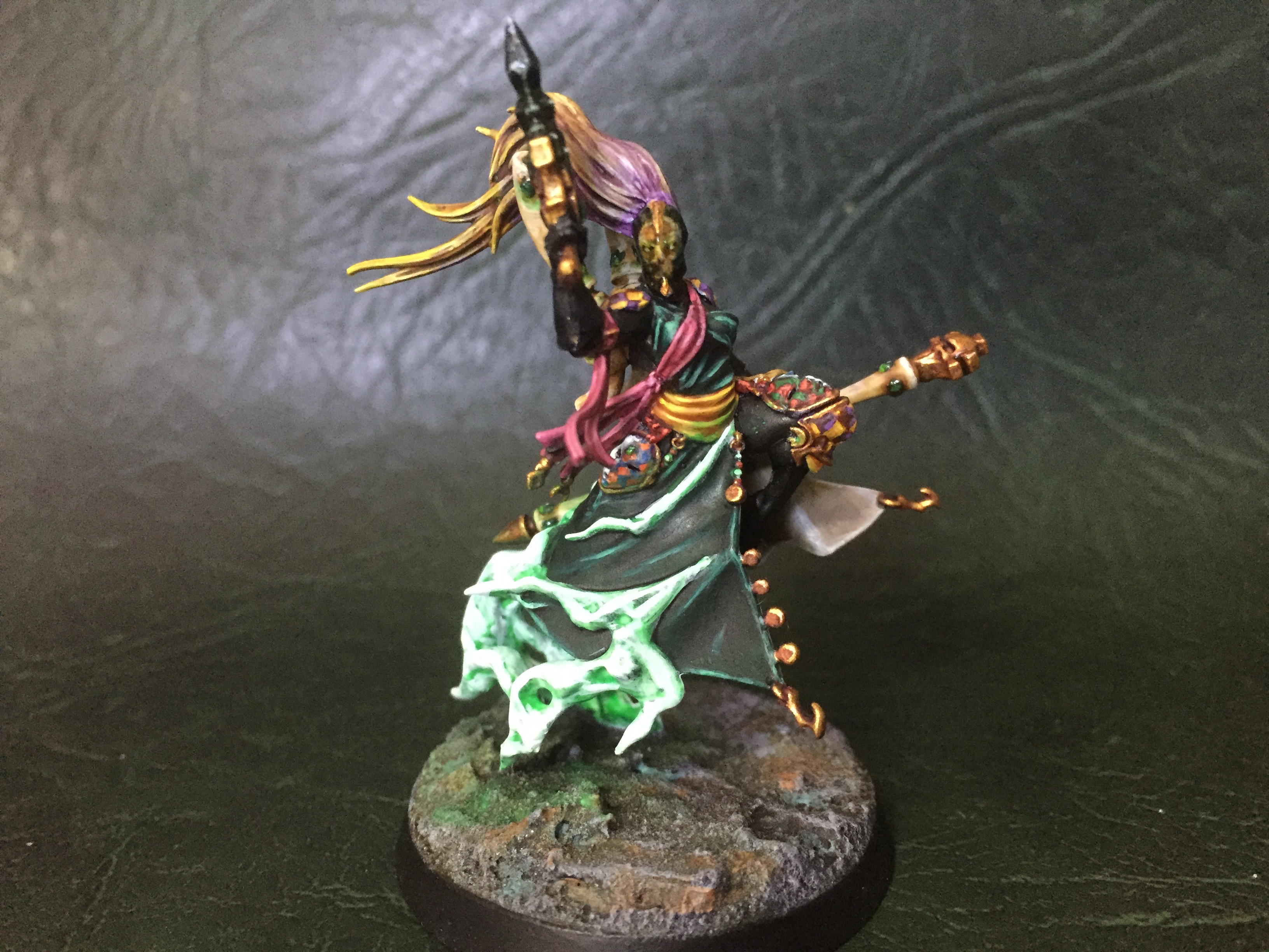
She is a conversion I did a few years ago, but never had the courage to paint – she’s a really complicated figure, and is intimidating as hell! She is based on the Mistweaver Saih from Warhammer Quest, but spliced with the Harlequin Shadowseer mini… yeah… two really detailed and tricky minis 😊
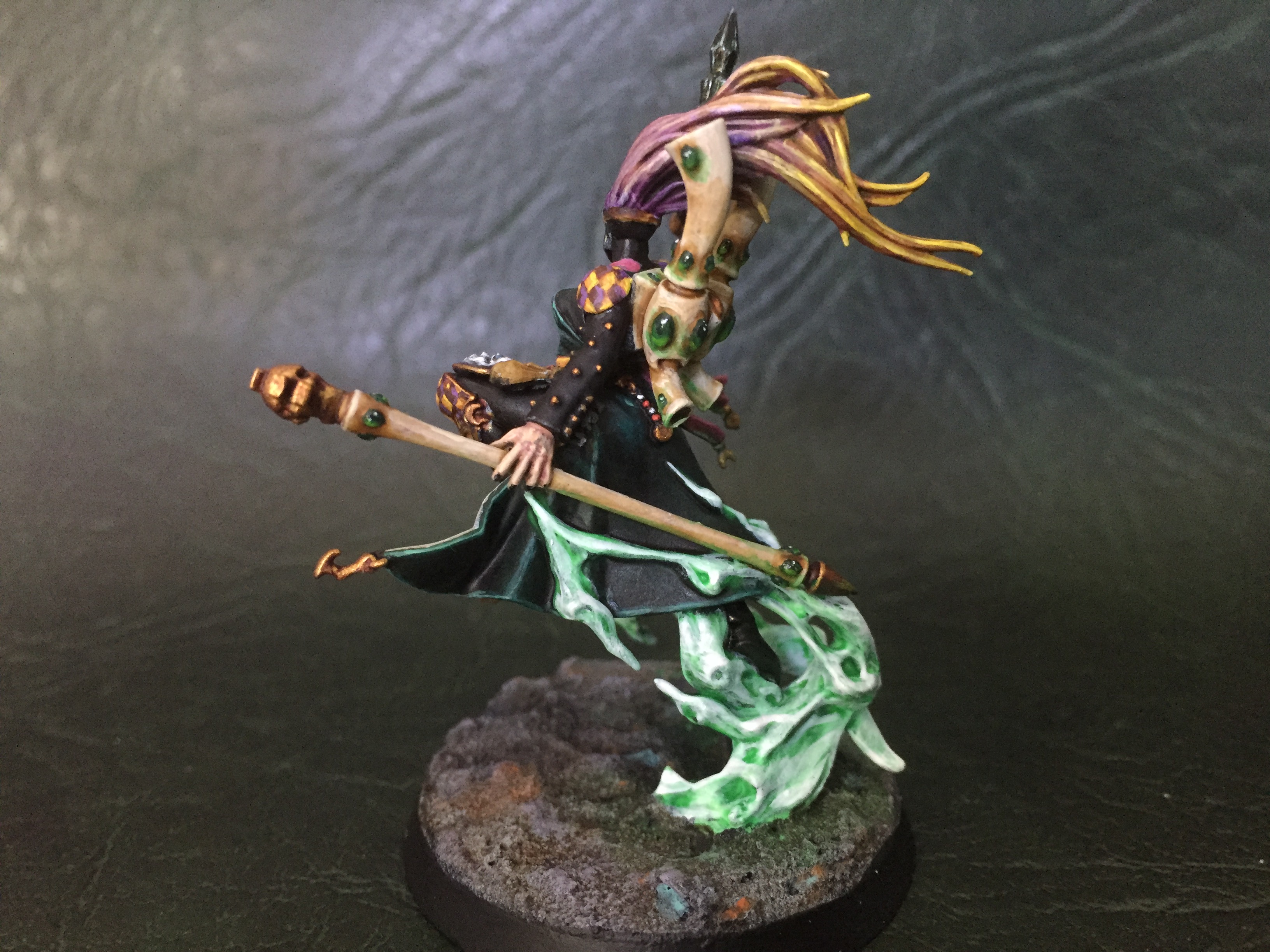
In terms of painting, I kept with the green and gold theme, but looked at the colour wheel to do some more fun stuff. I ended up with a Green/pink & yellow/purple thing going on, which works nicely I think – it’s tight, but allows for splashes of colour across the mini. I brought in a few more colour combos on the masks, but these are small enough to not confuse the overall scheme. I am particularly pleased with the smoke effect, given that it’s the first time I’ve tried to paint it.
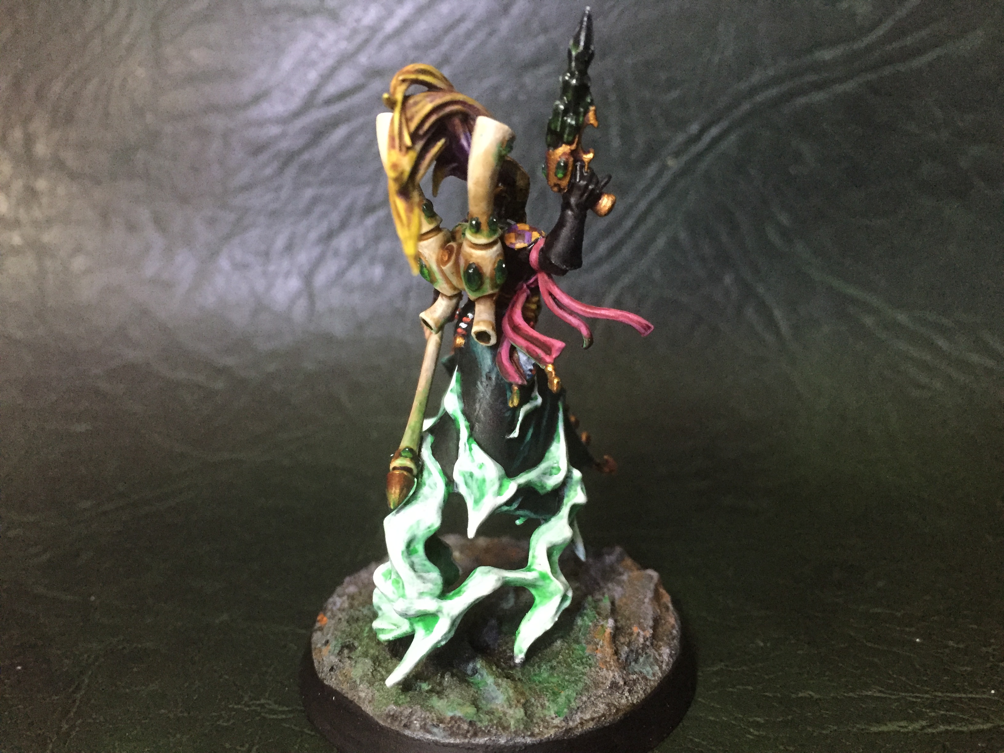
the mirror mask was a bit of an experiment as well… I was trying for a ‘ghost in the shell’ type effect with multiple layers of tinted gloss… The skull is quite hard to make out, and I wish I had smoothed out the whole face of the helm rather than leave those metal spikes in place, but hey ho, it’s not too bad, and I like a mini that rewards a closer look 😊
Here’s the two of them together – colours close enough to belong, but without being too uniform I hope…
In other news, there’s a new version of some Games Workshop game or other – personally, I’m finding it hard to find any fucks to give about it, but some of the minis look nice… I’ll leave it to better bloggers than me to comment in detail, but so far I’m not planning on getting involved… (that said, I am a sucker for a collector’s edition…)
Otherwise, that’s it from me for this week! I’ll be doing more Spero Secundus mooks over the week & weekend, maybe a Space Marine or some more Inquisitorial henchmen… we’ll see how it goes, but I’ll be back in a week or so. Stay safe 😊

Oooh, all very nice! :-)
Cheers mate 😊
Awesome work mate. The Harlequin is wonderful and looks like she fits right in with the Inquisitor ( I knew I’d break you eventually ;P) Spero Secundus is great fun and I’m looking forward to creating my character.
Cheers dude, and thanks for giving me the shove I needed to tackle her! I’m loving this back & forth creativity mate – I’m looking forward to meeting Delvain!!
Such a great selection here! You’ve done a wonderful job on a couple of intricate minis. A tip of the hat for the 30 minute minis too, that’s staggering speed.
Cheers mate, glad you like ‘em – it has been fun painting in such different ways tbh!
Great post Alex and even better figures. Most impressed by the speed painted figures. They have come out looking very good indeed. Moving on to the other two they are clearly several notches up in terms of detailed painting. Fun and rewarding to do, especially when the end results are so pleasing. Both are great but I really do like that Inquisitor.
Thanks dude, yeah, I do like a good speed paint – it’s nice to get a small unit done in an evening! The other two were fun too, but more in a ‘push yourself as a painter’ kinda way… I am pleased with the Inquisitor too – he has a real gravitas to him I think… 😊
Those are great- the concept and execution of the ash waste survivors is fantastic.
Cheers,
Pete.
Thanks mate, yeah, I’m quite happy with those guys – very quick and easy to do!
The wasteland warriors are cool and dirty – amazed that they were speed painted! The others are even more impressive. Love the gold details.
Cheers matey, nice to work with a few different styles 😁
nice, that inquisitor is great and the acolyte looks amazing.
Thanks dude – won’t lie, I’m pretty chuffed 😊
Great mix of figures! It’s really interesting to see the Tallarn rendered as non-militaristic types. The added goggles and de-Imperialisation work very nicely. Now I’m debating whether I need to pick up a squad!!
My favourite of the bunch is your inquisitor. Had you told me pre-paint that you were going to paint up a space marine as an inquisitor, I would have been convinced you’d be unable to change the look enough to avoid the figure looking like a space marine. Yet the combination of the new helmet, the candles, the exotic Eldar weaponry PLUS all those esoteric Deathwatch details are utterly convincing. He’s brilliant!
Cheers dude – I reckon Tallarn are actually really flexible for a set of monopose mooks! You could easily go a stage further with this idea, add spikes, skulls and weapon swaps to produce full-blown cultists… I might have to do that one day :-)
As for the Inquisitor, I picked him up ages ago with some half arsed idea for a project, but dug him out & looked at him with fresh eyes when Mark set up the invitational. I hoped he might look the part if i could steer him away from an obvious Marine silhouette. I think it helps that Primaris are now (in my mind) the default Marine – their bulk and different aesthetic makes it easier to sell ‘regular’ Marines as power armoured baseline humans… well, that’s my theory any way :-)
Lovely mate. All fantastic. It was a pleasure seeing your test model for the wasters unfold. They’ve turned out very well mate.
See you Saturday!
Cheers dude & thanks for the motivation!!
Lovely stuff. That Harlequin / Elf Mistweaver combination is really wonderful. Maybe I missed it earlier on your blog; is there a post of their assembly? I can’t even parse which bits came from where.
Thanks mate, and no – I don’t tend to do WIP posts… The Harlequin is just the two minis mentioned, so not actually a hard conversion! The Inquisitor was a bit more complex… bits from 8 different kits I think!
30 minutes?! What the shit? It’s take me at least two hours to achieve something half as good haha. I love the wasters man very, very cool indeed. 🤘🏼
Cheers dude – yep, 30 minutes… Well, 32 with the flames… Contrast paints are great for this kind of work 😊
I’ve done some experimenting with contrast paints but, at this stage, I’m still preferring the older paints
Fair play – if I was painting something ‘serious’ I’d stick with traditional paints, but these new jobbies do offer up something different for speed painting simple stuff. Another tool in the box mate 😊
I might give them a go with the speed painting of alllllllll the Zulus I have to do. Could work well. They work best over light undercoat and base colours though don’t they?
GW do two specific undercoats for the range – a grey and a bone colour, both super smooth. I haven’t tried those myself – I undercoat black, then a quick white spray from above, then an all-over white drybrush… The translucent nature of the contrast paints mean that your highlighting is basically done in one coat 😎
Hmmm might have to give that process a go
It’s quick, but practice on some stuff you don’t care about first.
😳 don’t care about??? I love alllll my little people hehe. Will do. 👍🏼
The rad wasters and House Malocchio guards are great, and half an hour to turn around a miniature to that level of quality is definitely something to be proud of. I really like the inquisitor as well, very much a case of “I wish I’d thought of that!”. I do like that Watch Master model but I’ve always been put off by him being a short-marine – yet whilst short-marines are a bit rubbish looking tall-inquisitors are quite the opposite! Oddly, now I think about it, I’ve never painted an actually Inquisitor either, another one to kick off the bucket list soon I think.
That Harlequin is just lovely, even though I’m physically cringing at the thought of how complicated and fiddly she must have been to put together. Well worth the effort though, and very alien in the way that Eldar should be I feel.
Aye, new 40k rules got a bit of a shrug from me but the new models are looking very interesting. Might be that the moment when I finally dip my toe into the world of Necrons has finally arrived.
That’s exactly it! Short-Marines suck, but tall Inquisitors rock 😎
Glad you like it all mate – bit of a mixed bag, but it’s all good fun. Totally agree that the Newcrons are looking very tasty… I’m really looking forward to seeing what people do with them!
Love that Mistweaver kitbash.
Cheers dude, she works quite well I think 😊
Wow, there’s so much happening here! What you achieved in this post is not easy at all, you balanced the kind of mass production paintjob (with an amazing standard) and the detailed, fine work. You master both kind of techniques, which require very different approaches. I’m so in awe!
Hey thanks mate, that’s kind of you – yeah, two very different styles, and I’m glad I can turn my hand to either 😊
I’m glad you’ve commented actually – I wanted to congratulate you on that amazing frigate!! So frickin’ cool mate, I don’t know how you had the patience! I love your blog, but remain frustrated that I can’t leave a comment 🙄
Very impressive pair, Alex – they look great and I love the builds as well, making them into a unique set of figures. The two squads of troopers are great as well. Makes me want to finish my little group of Tallarn – if I can ever find ’em!
Cheers dude :-)
Ha, I knew you would paint the Mistweaver Saih conversion before I painted mine!
And very fine work indeed.
The inquisitor is great too, always good to see more variety in those blokes.
Cheers dude – been putting her off for ages too mate, she’s a helluva mini to paint 😳